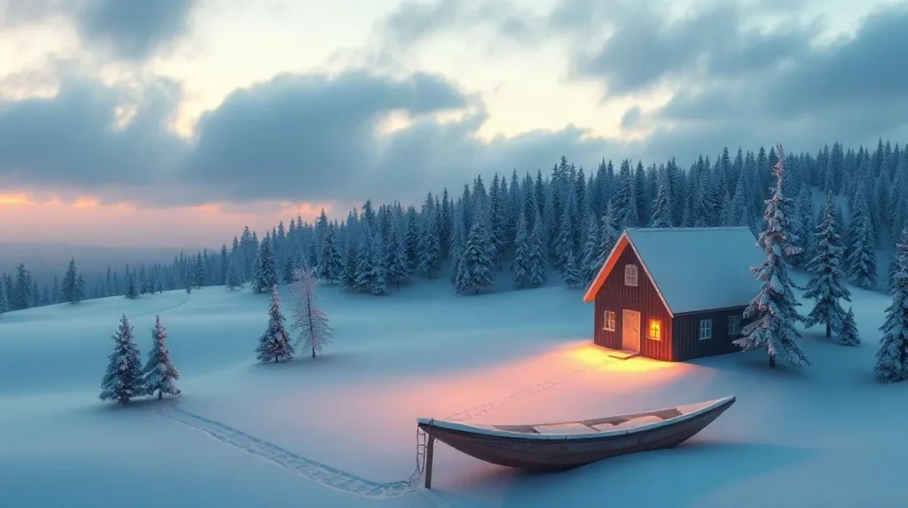
Nordic light profoundly influenced 19th-century painting by imbuing scenes with a unique emotional depth characterized by subtle contrasts, cool tones, and atmospheric nuance. This distinctive illumination shaped artists’ approaches to mood, emphasizing introspection and the interplay between light and shadow to evoke complex feelings.
The quality of light in Nordic countries—soft, diffused, and often muted due to long winters and low sun angles—offered painters a natural palette that differed markedly from the bright, direct sunlight typical in southern Europe. This atmospheric condition encouraged exploration of quiet, contemplative themes and heightened sensitivity to the emotional resonance of landscapes and interiors.
Understanding how Nordic light shaped 19th-century painting emotionally reveals much about the cultural and environmental context driving artistic innovation during this period. It highlights the profound connection between environment and expression, illustrating how natural phenomena can shape entire movements and the psychological impact of visual art.
| Characteristic | Light Quality | Artistic Technique | Emotional Impact |
|---|---|---|---|
| Low solar angle | Diffuse, cool light | Layered glazes (Gallen-Kallela) | Mystical, somber mood |
| Extended twilight | Long-lasting dim light | Palette knife textures (Balke) | Isolation and sublime nature |
| Seasonal extremes | Short winter daylight, long summer nights | Dark palettes in winter, bright scenes in summer | Introspective vs. social themes |
- 300-500 lux Measured intensity of Nordic daylight during early evening
- 12 francs per gram Historical cost of cobalt blue pigment in 1850
- 4000K Color temperature of museum LED lighting replicating Nordic light
- 250,000 Annual visitors to the National Gallery of Norway viewing Nordic light paintings
- 20 hours Maximum daylight hours in Helsinki during summer
What makes Nordic light distinct in the context of 19th-century painting?
Geographical and atmospheric factors
Nordic light in the 19th century is distinct due to its origin in high-latitude regions above 60°N, such as Norway and Finland, where the sun remains low on the horizon and twilight can extend for up to three hours during summer months. This prolonged twilight and low solar angle create a diffuse, cool-toned illumination that markedly differs from the harsh, direct sunlight of southern Europe. The Scandinavian Peninsula’s unique atmospheric conditions result in a palette that favors muted whites, grays, and blues, profoundly influencing painters’ choices in color and mood depiction in their works.
Measured light intensity and color temperature
According to measurements by the Norwegian Meteorological Institute in 2020, light intensity during early evening in Nordic locations typically ranges between 300 and 500 lux, significantly lower than the 10,000 to 25,000 lux common in southern European daylight. This reduced intensity produces softer shadows and a cooler color temperature, encouraging artists to emphasize atmospheric effects and emotional subtlety through restrained tonal contrasts. The dominance of cool blues and grays in the Nordic light shaped 19th-century painters’ techniques, fostering a distinctive emotional resonance in their landscapes and portraits.
- Latitude: above 60°N, including Norway and Finland
- Summer twilight duration: up to 3 hours
- Light intensity range: 300–500 lux in Nordic early evening
- Southern Europe daylight intensity: 10,000–25,000 lux
- Dominant color palette: blues, grays, muted whites
How did painters like Peder Balke and Akseli Gallen-Kallela use Nordic light to evoke emotion?
Emotional tones achieved
Peder Balke and Akseli Gallen-Kallela harnessed Nordic light to evoke distinct emotional atmospheres rooted in their regional landscapes and cultural narratives. Balke’s Arctic seascapes from circa 1830 to 1870 use stark contrasts between shadow and bright light to express isolation and the sublime power of nature, capturing the harsh northern environment’s emotional intensity. In contrast, Gallen-Kallela’s 1893 painting *The Defense of the Sampo* employs twilight hues and subdued daylight tones to evoke a mystical mood intertwined with Finnish national romanticism and folklore, creating a sense of reverence and mythic depth.
Technical adaptations to light conditions
Both painters adapted their techniques to reflect the unique qualities of Nordic light on natural elements like water and snow. Balke frequently applied palette knives to build textured surfaces that emphasize reflective light effects, enhancing the physicality of his seascapes. Gallen-Kallela, meanwhile, layered glazes meticulously to simulate atmospheric depth and the muted, diffuse glow of northern twilight. Their brushwork carefully captures the interplay of light and texture characteristic of the Nordic environment, contributing to the emotional resonance of their scenes.
- Peder Balke’s works sold at Christie’s in 2025 fetched between $150,000 and $500,000, underscoring ongoing appreciation for his emotive light contrasts.
- Akseli Gallen-Kallela’s use of twilight and muted daylight effects in *The Defense of the Sampo* (1893) exemplifies his approach to national romanticism through atmospheric light.
What role did Nordic museums and exhibitions play in preserving and showcasing this light-influenced art?
Collection focus and visitor engagement
Nordic museums like the National Gallery of Norway and the Ateneum Art Museum in Helsinki have played a pivotal role in preserving and showcasing light-influenced 19th-century painting by housing extensive collections and staging major exhibitions. The National Gallery of Norway holds over 40 works by Peder Balke, drawing around 250,000 visitors annually who are particularly attracted to the distinctive interplay of light and landscape in his art. Meanwhile, the Ateneum’s 2024 retrospective on Akseli Gallen-Kallela featured more than 90 pieces highlighting twilight effects and attracted over 180,000 visitors, underscoring the public’s strong interest in Nordic light as an artistic theme.
Exhibition lighting standards
Both institutions have invested significantly in advanced lighting technology to replicate authentic Nordic daylight conditions indoors, enhancing the viewing experience. They use LED lighting systems calibrated to a color temperature of 4000K, a standard chosen to mimic the cool, diffuse quality of Nordic daylight. This lighting calibration allows visitors to perceive the paintings as close to their original atmospheric context as possible, emphasizing subtle tonalities and emotional depth. Key criteria for this approach include:
- LED systems set at 4000K color temperature for daylight simulation
- Consistent luminance levels to protect artwork while preserving visual clarity
- Installation of energy-efficient, low-heat emission lights to prevent damage
These measures reflect a broader Nordic commitment to both conservation and interpretive authenticity in exhibiting light-sensitive artworks.
When does the use of Nordic light in painting face limitations or misinterpretations?
Geographical and technical challenges
The use of Nordic light in painting faces limitations and misinterpretations primarily when artists work outside the high northern latitudes, where the unique atmospheric conditions are absent. Artists unfamiliar with Nordic environments often depict its subtle color shifts and prolonged dimness with exaggerated brightness or warmth, losing the nuanced emotional resonance intrinsic to the light itself. In the 19th century, these challenges were compounded by technical constraints such as the high cost and limited availability of pigments; for instance, cobalt blue—a key color for capturing the cool tones—cost approximately 12 francs per gram in 1850, restricting precise color matching for many painters.
Reproduction and pigment limitations
Commercial reproductions of Nordic landscapes frequently fail to convey the true atmospheric quality due to the limitations of standard color profiles. The widespread use of sRGB color space in printing and digital media cannot fully represent the diffuse blue-grey palette characteristic of Nordic light, resulting in color distortions that diminish the intended emotional effect. This issue is compounded by pigment availability during the 19th century, where artists contended with a narrow range of blues and greys, often relying on expensive or unstable pigments that could not faithfully reproduce the cool, muted hues found in natural Nordic light.
- Cobalt blue pigment price: about 12 francs per gram in 1850
- Standard sRGB color profile limitations in reproductions
- Geographical absence of Nordic atmospheric conditions outside high latitudes
How did the seasonal variations in Nordic light influence the thematic choices of 19th-century painters?
Winter darkness and mood
Seasonal variations in Nordic light directly shaped the thematic focus of 19th-century painters by prompting introspective and somber subjects during the long, dark winters. In Helsinki, daylight hours drop to approximately 4 per day in December, as recorded by the Finnish Meteorological Institute, creating an environment conducive to reflection and quietude. Erik Werenskiold’s winter landscapes from the 1880s vividly express this mood, using muted palettes and sparse compositions to capture the stillness of the season. The limited daylight of 2-5 hours typical across Nordic regions in winter encouraged artists to explore themes of solitude, melancholy, and the stark beauty of snow-covered nature.
Summer light and social themes
Conversely, the summer months brought nearly continuous twilight, with Helsinki experiencing up to 20 daylight hours in June, dramatically influencing painters to depict brighter, more sociable scenes. These ‘white nights’ inspired artists like Frits Thaulow in the 1890s to create Impressionist works characterized by vivid colors and lively depictions of outdoor gatherings. The extended light allowed for prolonged social activity, which artists translated into compositions celebrating human connection and the vibrancy of summer life.
- Winter daylight: 4 hours per day in December (Finnish Meteorological Institute)
- Summer daylight: up to 20 hours per day in June (Finnish Meteorological Institute)
- Erik Werenskiold’s winter landscapes: 1880s
- Frits Thaulow’s Impressionist social scenes: 1890s
Frequently asked questions
Why does Nordic light appear cooler and more diffuse than southern European light?
Which artists are most associated with depicting Nordic light in the 19th century?
How do museums recreate Nordic light conditions for viewing art indoors?
What challenges do artists face in representing Nordic light accurately?
Key takeaways
- Nordic light’s low intensity and extended twilight shape a cool, diffuse color palette unique to northern latitudes.
- 19th-century painters like Balke and Gallen-Kallela adapted brushwork and color layering to express emotional depth through light.
- Museums employ calibrated lighting systems at 4000K to faithfully present Nordic light effects indoors.
- Seasonal daylight extremes influenced thematic choices, from dark, introspective winters to luminous summer scenes.
- Pigment cost and reproduction techniques have historically limited the faithful portrayal of Nordic light’s subtle hues.