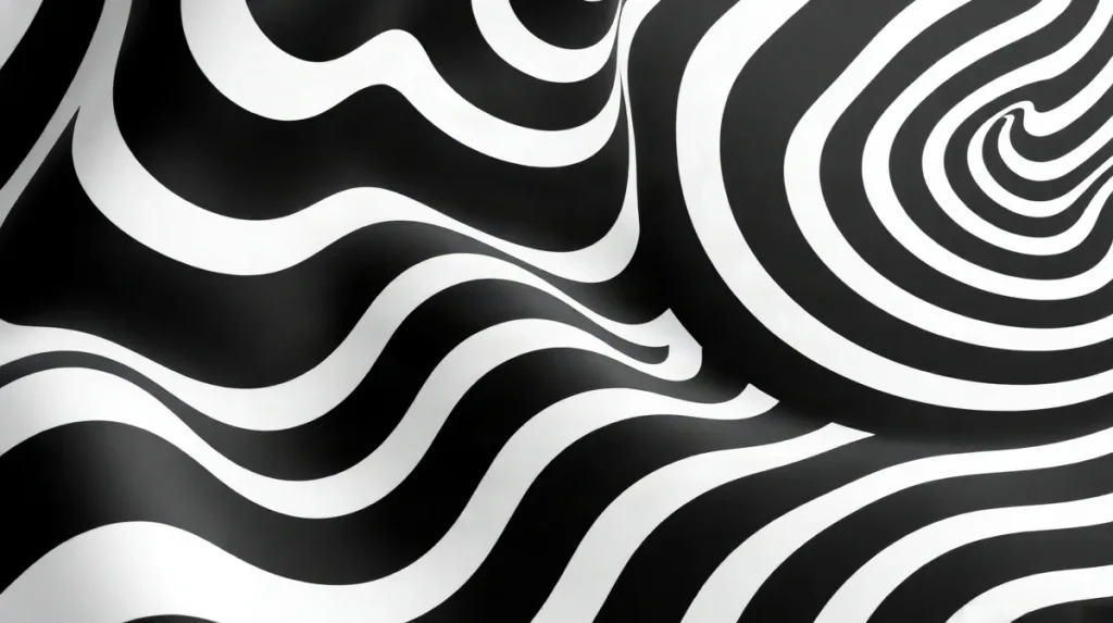
Optical art, or Op Art, captivates viewers by creating vivid illusions of movement and depth through carefully orchestrated visual effects. This artistic approach relies on precise patterns, contrasting colors, and geometric shapes to trick the eye, making static images appear dynamic and shifting. Understanding Optical Art’s techniques for creating visual movement reveals how artists manipulate perception to evoke a sense of energy and rhythm on a flat surface.
By employing strategies such as repetitive lines, moiré patterns, and color contrasts, Optical Art stimulates the viewer’s visual cortex, causing the sensation of vibrating or pulsating motion. These techniques play with the brain’s interpretation of space and light, generating effects that can seem almost hypnotic or disorienting. Exploring how these methods work offers insight into the intersection of art and human psychology, demonstrating the power of visual language to engage and challenge our sensory experience.
| Technique | Description | Example Artist | Visual Effect |
|---|---|---|---|
| Geometric Repetition | Repeating shapes create illusion of motion | Bridget Riley | Simulated movement on flat surfaces |
| Tonal Contrast | Strong black and white contrasts enhance depth | Victor Vasarely | Figure-ground ambiguity and vibration |
| Color Vibration | Complementary colors placed side-by-side induce flicker | Bridget Riley | Shimmering and pulsation effects |
- 1960s Decade when Op Art emerged as a distinct movement
- 2–3 meters Optimal viewing distance for many Op Art works
- 1938 Year Victor Vasarely created 'Zebra', a seminal Op Art piece
- 1961 Year Bridget Riley painted 'Movement in Squares'
How does geometric repetition create movement in Optical Art?
Role of Pattern
Geometric repetition creates the sensation of movement in Optical Art by systematically arranging repeated lines, grids, and shapes like circles and squares to trick the eye on a flat surface. Bridget Riley’s iconic 1961 work, Movement in Squares, exemplifies this technique with its precise sequencing of squares that appear to undulate and shift. The frequency of repetition, often spaced within millimeters—commonly between 5 and 10 mm on the canvas—directly affects how rapidly the eye perceives motion. Closer spacing tends to speed up the visual vibration, while wider intervals slow the effect. These repeating geometric motifs manipulate the viewer’s perception, making static images feel dynamic.
Impact of Precision
In Optical Art, geometric accuracy is fundamental; even minor deviations can disrupt the illusion of movement. Artists like Riley rely on exact measurements to maintain consistency across repeated elements, ensuring the pattern’s integrity. Deviations as small as 1 mm can weaken the intended visual rhythm, diminishing the sense of flow. Production standards in Op Art often demand this level of precision, akin to design tolerances found in industrial fabrication processes. This meticulous control over shape and spacing sustains the optical effect, allowing viewers to experience compelling visual movement without actual physical motion.
- Typical repetition spacing: 5–10 mm between shapes on canvas
- Precision threshold: deviations under 1 mm to preserve illusion quality
- Example artwork: Bridget Riley’s Movement in Squares (1961)
What role does tonal contrast play in enhancing optical illusions?
Contrast for Depth
Tonal contrast plays a crucial role in enhancing optical illusions by intensifying the perception of depth and movement within a flat image. High contrast between black and white, often approaching a 100% difference in luminance, amplifies visual vibration, making patterns appear to shimmer or pulse. This effect is evident in Victor Vasarely’s 1938 work Zebra, where alternating black and white stripes create a strong sense of perceived motion. The stark distinction between these tones forces the viewer’s eye to engage dynamically, as the brain interprets the sharp edges as spatial shifts rather than static shapes. Many iconic Op Art pieces from the 1960s, including works by Bridget Riley, rely on this maximal tonal contrast to generate illusions of three-dimensionality and kinetic energy on a two-dimensional canvas.
Figure-Ground Effects
Tonal contrast also facilitates figure-ground ambiguity, a visual phenomenon where the boundary between foreground and background becomes unstable, causing the eye to oscillate between different interpretations of the image. This ambiguity is created when black and white areas of nearly equal size and sharp edges are juxtaposed, resulting in an uncertain spatial relationship that stimulates continuous visual reinterpretation. For instance, Vasarely’s Zebra employs black and white stripes of roughly equal width to confuse the eye’s focus, making the stripes simultaneously appear as both figure and ground.
- Contrast ratio threshold: close to 21:1 luminance difference for maximum clarity
- Stripe width in Zebra: approximately 2 cm per stripe
- Typical Op Art palette: black (#000000) and white (#FFFFFF) for optimal tonal contrast
This deliberate ambiguity heightens the optical illusion’s impact, creating a dynamic, shifting visual experience that is central to Op Art’s appeal.
How do color vibrations contribute to the sense of movement?
Complementary Colors
Color vibrations contribute to the sense of movement in Optical Art primarily through the use of complementary colors placed side-by-side, which create retinal afterimages and visual flickering. This phenomenon occurs because the eye struggles to focus on sharply contrasting hues such as red and green or blue and orange, causing a shimmering effect that appears to pulse or shift. Bridget Riley’s 1963 painting Fall exemplifies this technique by juxtaposing contrasting colors to generate a dynamic, almost vibrating surface. Scientific studies show that these afterimages can last from fractions of a second up to several seconds, depending on the intensity and saturation of the colors involved, which artists exploit to sustain the illusion of movement. In Op Art exhibitions of the 1960s, works employing this technique often measured around 1 to 2 meters in height, providing a large enough scale to maximize the viewer’s immersive experience.
Psychedelic Color Effects
The rise of bright, psychedelic colors in the 1960s expanded Optical Art beyond its earlier monochrome roots, introducing new ways to simulate pulsation and flashing effects through variations in color frequency and saturation. Artists varied color saturation between 70% and 100% to intensify visual vibration, creating an impression of flickering light or throbbing motion on a static canvas. This shift allowed for more complex visual rhythms that could engage viewers for longer periods, as the eye follows shifting patterns of intense color. Notable Op Art pieces from this era, including Riley’s later work, often employed these saturated hues in large-scale prints or paintings priced between $15,000 and $150,000, reflecting their continued appeal among collectors fascinated by the interplay of color and movement.
- Afterimage duration: fractions to several seconds, depending on color intensity
- Typical Op Art scale: 1 to 2 meters in height
- Color saturation range: 70% to 100% for vibrancy
- Market price range (1960s psychedelic Op Art): $15,000 to $150,000
When do Optical Art techniques fail to create convincing movement?
Technical Limitations
Optical Art techniques fail to create convincing movement primarily when geometric precision is compromised or when color contrasts are improperly applied. Precision in repeating shapes and lines is critical; inaccuracies can cause the intended dynamic effect to flatten, making patterns appear static rather than kinetic. For example, artworks with line deviations exceeding 1 millimeter often lose their illusion of motion. Additionally, overusing multiple contrasting colors beyond a palette of three or four can confuse the eye and reduce depth perception. Black and white contrasts remain the most effective for intense optical illusions, as seen in Bridget Riley’s works, where tonal contrast ratios of at least 80% difference between light and dark areas are maintained to maximize visual impact.
Viewer and Environmental Factors
The success of optical illusions in Op Art also hinges on environmental conditions and viewer physiology. Proper lighting is essential—too dim or overly harsh lighting can nullify the illusion’s effect. Artists commonly specify an optimal viewing distance of 2 to 3 meters to allow the eye to integrate the patterns into perceived movement. Viewing beyond 5 meters typically diminishes the intended optical vibration. Furthermore, viewer fatigue or visual impairments, such as astigmatism or color blindness, can significantly limit the effectiveness of these illusions. Prolonged exposure beyond 10 minutes may also cause eye strain, reducing the viewer’s sensitivity to the artwork’s dynamic qualities.
- Line deviation threshold: 1 millimeter for illusion integrity
- Color contrast palette: limited to 3-4 colors for clarity
- Tonal contrast difference: minimum 80% for black and white patterns
- Optimal viewing distance: 2–3 meters recommended by artists
- Maximum effective viewing distance: approximately 5 meters
- Viewing duration limit: around 10 minutes before fatigue affects perception
What are common mistakes artists make when attempting Optical Art illusions?
Design Errors
One of the most frequent mistakes artists make when creating Optical Art illusions is inconsistent line thickness or irregular spacing, which disrupts the geometric harmony essential for the intended visual effect. For example, variations greater than 0.1 mm in line width can break the continuity needed for seamless movement illusions. Additionally, overcomplicating patterns can overwhelm viewers rather than engage them; artworks featuring more than 50 repetitive elements per square decimeter tend to lose clarity and diminish the optical impact. Another common error is using low contrast color schemes that fail to establish a strong figure-ground distinction. While black-and-white contrasts remain the standard—such as those found in Bridget Riley’s works from the 1960s—attempts to substitute with muted tones or colors closer than 20% difference in luminance often produce weak illusions that lack vibrancy.
Environmental Neglect
Ignoring recommended viewing conditions significantly undermines the success of Optical Art illusions. Optimal perception frequently depends on specific angles and distances; for instance, many Op Art pieces are designed to be viewed from 2 to 3 meters away to maximize the effect. Museums such as the Tate Modern advise maintaining consistent lighting levels around 300 lux to avoid glare and shadows that obscure patterns. Moreover, artworks displayed without consideration of ambient light temperature—ideally between 4000K and 5000K—can cause color shifts that reduce contrast. Artists and curators who neglect these environmental factors risk diminishing the dynamic movement that Optical Art aims to evoke.
How have Optical Art techniques influenced contemporary visual art and design?
Commercial Applications
Optical Art techniques have significantly shaped contemporary visual art and design, particularly in the commercial sector where dynamic visual movement captivates audiences. Modern graphic design frequently employs Op Art principles such as geometric repetition and stark tonal contrasts to create compelling brand identities and advertising visuals. For example, companies like Adobe offer digital art tools, including Adobe Illustrator 2026, which enable designers to execute precise geometric patterns and color vibrations at the pixel level, enhancing illusion effects with unparalleled accuracy. In branding, these techniques help deliver vibrant, kinetic impressions that boost consumer engagement, often commanding design budgets ranging from $10,000 to $50,000 for campaign visuals incorporating Op Art elements.
Museum Exhibitions
Institutional recognition of Optical Art’s ongoing influence is evident in major exhibitions like the 2026 ‘Op Art Revisited’ show at Tate Modern, which highlights the movement’s sustained relevance and its dialogue with contemporary artists worldwide. The Museum of Modern Art (MoMA) in New York also plays a critical role by maintaining one of the most comprehensive Op Art collections, featuring works that continue to inspire emerging artists. These exhibitions emphasize key Op Art techniques such as:
- Geometric repetition using grids and shapes to induce visual vibration
- High-contrast black and white patterns for intensified optical illusions
- Color modulation and tonal contrast to create depth and perceived movement
These curatorial choices ensure Optical Art remains a vital reference point in discussions of visual perception and digital aesthetics in 2026 and beyond.
Frequently asked questions
What is the main visual effect Optical Art aims to produce?
Why is black and white so commonly used in Op Art?
Can color be used effectively in Optical Art?
What viewing conditions optimize Optical Art illusions?
Who are some key artists associated with Optical Art?
Key takeaways
- Geometric repetition is fundamental to simulating motion in Op Art.
- Black and white tonal contrast maximizes illusion strength.
- Complementary color vibrations create dynamic flickering effects.
- Precision and viewing conditions are critical for successful illusions.
- Key Op Art artists include Bridget Riley and Victor Vasarely.
Sources
- Article — “The Science of Seeing: Understanding Bridget Riley's Artistic Techniques | MyArtBroker”
- maddoxgallery.com — “What Is Op Art? The Movement, the Masters and the Optical Illusion Artists Mesmerising Collectors Today”
- teravarna.com — “Know about optical illusions and op art masterpieces”
- Art UK — “Seven artists inspired by the Op Art movement”
- wildcatsarts.weebly.com — “OPTICAL ILLUSION ART – Visual Arts Enrichment with H.L. Groenstein”