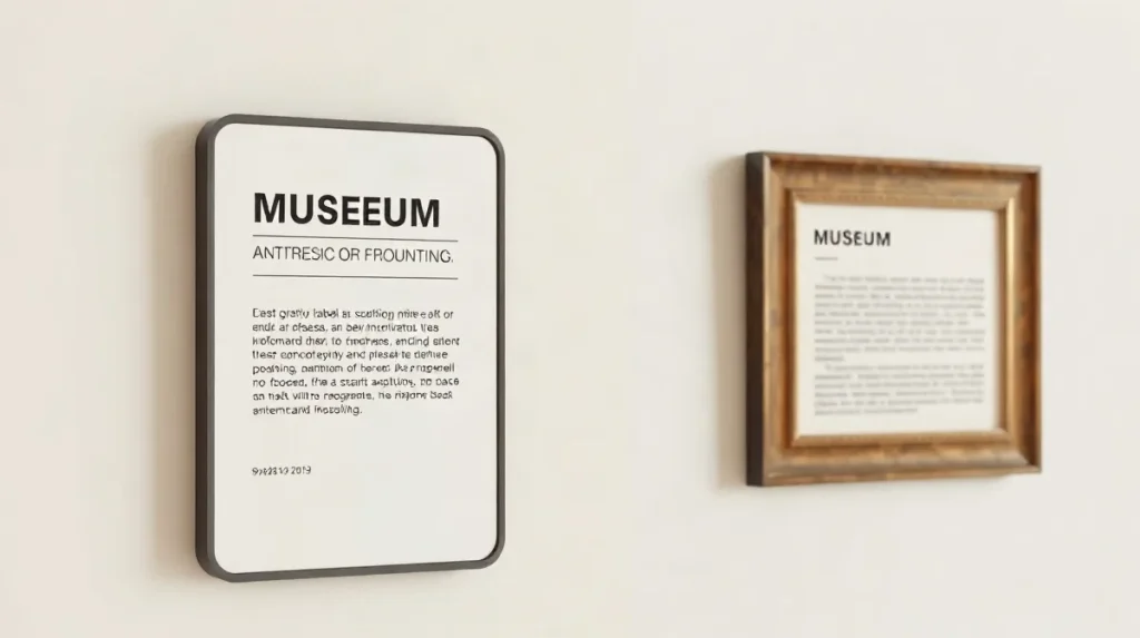
Exhibition labels enhance visitors’ understanding of paintings by providing essential context, explaining artistic techniques, and revealing historical or cultural significance that might otherwise be overlooked. These concise texts act as interpretive guides, enriching the viewing experience and deepening engagement with the artwork.
In art exhibitions worldwide, labels serve as a bridge between the viewer and the artist’s intent, offering insights that transform a simple glance into meaningful appreciation. Without such explanations, many paintings risk being seen only superficially, their stories and nuances lost on audiences unfamiliar with art history or symbolism.
By highlighting key details and inviting reflection, exhibition labels elevate the educational value of galleries and museums. They empower visitors to connect more fully with the works on display, making art accessible and relevant to diverse audiences across different cultures and backgrounds.
| Label Type | Cost per Unit | Durability | Visitor Engagement |
|---|---|---|---|
| Printed paper label | $1-$3 | 3-7 years (archival paper) | High for concise text |
| Acrylic panel label | $10-$20 | 7+ years (glare resistant) | High with good lighting |
| Digital touchscreen label | >$10,000 | Variable (hardware lifespan) | Very high with multimedia |
| QR code enhanced label | $2-$5 (printed) | 3-7 years | Medium, depends on visitor tech use |
- 80-120 words Optimal exhibition label text length
- 12-14 points Standard font size for label readability
- $15,000 Cost of digital label prototype testing per exhibition
- 5 years UV resistant ink longevity for labels in museums
What are the key elements that make exhibition labels effective for paintings?
Conciseness and clarity
Effective exhibition labels for paintings balance brevity with meaningful content, typically restricting text to 80–120 words to avoid overwhelming visitors. The American Alliance of Museums guidelines (2023) recommend this range to maintain visitor engagement and comprehension. Additionally, labels use a standard font size between 12 and 14 points, which ensures legibility from about 1 meter away, facilitating easy reading without straining the eyes.
Essential information components
Key elements included on labels are the artist’s name, artwork title, creation date (such as 1889 for Van Gogh’s Starry Night), medium (e.g., oil on canvas), and dimensions stated in centimeters. Incorporating one or two interpretive sentences adds contextual insight without causing cognitive overload, guiding visitors to better understand the work’s significance and background.
- Text length: 80–120 words per label (American Alliance of Museums, 2023)
- Font size: 12–14 points for readability at 1 meter distance
- Artwork details: artist name, title, date, medium, dimensions in cm
- Interpretive content: 1–2 sentences to enhance visitor understanding
How do curators and writers balance detail and brevity in painting labels?
Readability metrics
Curators and writers balance detail and brevity in painting labels by focusing on one key theme per label and aiming for clear readability suited to general audiences. The Getty Museum’s 2025 label-writing workshop recommends this approach to prevent visitor fatigue and ensure concise communication. Professional writers often use readability formulas like the Flesch-Kincaid Grade Level, targeting scores between 60 and 70, which corresponds to a reading level accessible to most visitors.
This readability benchmark helps labels avoid overly complex language while still conveying meaningful content. Additionally, institutions such as Tate Modern invest approximately $15,000 per exhibition on digital label prototypes to test wording and presentation before final printing, ensuring labels communicate effectively without overwhelming visitors.
Visitor engagement optimization
Maintaining visitor engagement requires controlling label length and reading time. Labels are designed for an average reading time under 45 seconds, a threshold that helps sustain visitor flow during busy exhibitions without rushing or causing bottlenecks. By limiting text to one main idea and concise language, labels offer depth without sacrificing brevity, striking a balance between informing and engaging.
- One key theme per label (Getty Museum, 2025 workshop)
- Flesch-Kincaid Grade Level score of 60–70 for readability
- Under 45 seconds average reading time per label
- Approximate $15,000 cost for digital label prototyping at Tate Modern
What technologies and materials influence the production of exhibition labels?
Material durability
Exhibition labels commonly rely on matte-finish, archival-quality materials that ensure longevity and readability without glare. Most museums select paper weighing between 250 and 300 gsm, providing a sturdy base resistant to wear. Acrylic panels are also used for their robustness and sleek appearance. The Smithsonian Institution in 2024 noted that UV-resistant inks can extend label lifespans beyond five years even under intense lighting conditions, preventing fading and discoloration.
Digital augmentation
To enhance visitor engagement without overcrowding physical labels, institutions like the Louvre introduced QR codes in 2026. These codes link to extended content, allowing deeper exploration via smartphones. Another technological advancement involves touchscreen digital label displays, which can cost $10,000 or more per unit, making them practical mainly for flagship paintings or temporary exhibitions. This blend of traditional and digital approaches balances durability, accessibility, and depth of information.
- Matte-finish archival paper: 250–300 gsm
- UV-resistant ink lifespan: over 5 years under high light (Smithsonian Institution, 2024)
- Touchscreen digital label cost: upwards of $10,000 per unit
- QR code implementation: Louvre museum, 2026
When do exhibition labels fail to enhance visitor understanding, and what are common pitfalls?
Exhibition labels fail to enhance visitor understanding when they use overly technical language, are excessively long, or suffer from poor design choices that hinder readability and emotional connection. Such pitfalls reduce engagement, comprehension, and recall among diverse audiences, limiting the educational potential of the display.
Language accessibility
The use of jargon and specialized terminology alienates a significant portion of visitors. Visitor feedback surveys at the Museum of Modern Art (MoMA, 2025) found that up to 30% of attendees felt excluded by overly technical language. Additionally, labels exceeding 200 words tend to discourage thorough reading, leading to lower visitor engagement. Omitting key information such as provenance or historical context also detracts from emotional resonance, reducing visitor recall by roughly 25% according to MoMA’s 2025 evaluations.
Design and placement issues
Physical presentation plays a critical role in label effectiveness. Poor lighting and font choices impact legibility, especially for older visitors; thin fonts smaller than 10-point size particularly impede readability for those over 60. Labels placed in dim or glare-prone areas further diminish visibility. To optimize accessibility, labels should:
- Use clear, jargon-free language accessible to general audiences;
- Limit length to under 200 words to maintain engagement;
- Employ fonts of at least 10-point size with sufficient weight for easy reading;
- Be positioned under adequate lighting avoiding shadows or glare;
- Include provenance and historical context to foster emotional connection and improve recall.
How do museums test and refine exhibition labels before final installation?
Museums test and refine exhibition labels by gathering direct visitor feedback through focus groups and controlled testing, then iteratively revising texts to improve comprehension and engagement before final installation. This process ensures labels communicate effectively and resonate with diverse audiences.
Visitor feedback integration
The Smithsonian Institution employs visitor focus groups involving at least 50 participants per exhibition to evaluate sample label texts. Similarly, the National Gallery in London conducts A/B testing of label versions over two-week periods, measuring visitor comprehension and interest levels. Surveys assessing recall demonstrate that labels refined through this visitor input can boost information retention by 15-20%, confirming the value of audience-driven revisions.
Iterative development
Label refinement typically spans 4-6 weeks within the exhibition planning phase, balancing the need for detailed content with budget constraints. This timeline allows for multiple rounds of editing based on feedback, ensuring clarity and relevance. Museums weigh factors such as:
- Number of focus group participants (at least 50 for robust feedback)
- Duration of A/B testing (approximately 14 days for measurable data)
- Improvement in visitor recall (targeting 15-20% increases)
- Time allocated for revisions (4 to 6 weeks)
Frequently asked questions
Why are exhibition labels usually short?
What font size is standard for museum labels?
Can digital labels replace traditional printed ones?
How do museums avoid jargon in labels?
Key takeaways
- Effective labels balance concise text with essential painting details
- Readability and visitor engagement guide label length and language
- Durable materials and UV-resistant inks prolong label quality
- Excessive jargon and length reduce visitor comprehension
- Visitor testing refines labels to improve understanding