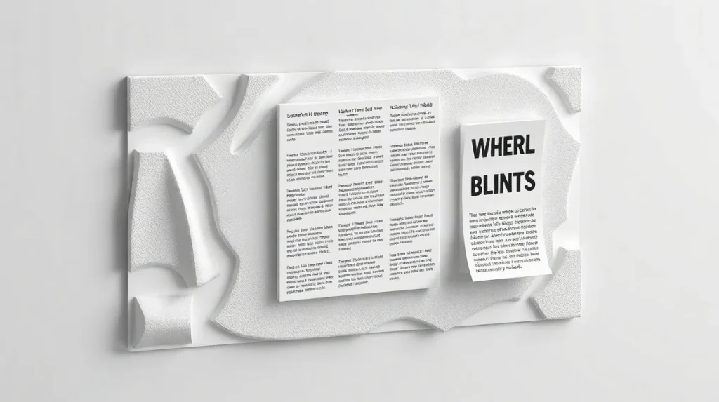
Accessible screen-printed graphics for installations are printed visual elements designed to be legible, durable, and easy to navigate within an exhibition space. They help an installation communicate with a wider audience by combining clear image-making, considered scale, and materials that can be adapted to walls, panels, or other site-specific surfaces.
For artists and curators, the appeal of screen printing lies in its flexibility: it can produce bold, repeatable graphics that support wayfinding, interpretation, or atmosphere without overwhelming the work itself. In that sense, accessible screen-printed graphics for installations sit between design and fine art, shaping how visitors read a space as much as how they experience it.
That balance becomes especially important when a project needs visual clarity without losing artistic character. Choices about ink, surface, contrast, and placement all affect whether the graphics remain readable across a room, a corridor, or a more complex installation environment; for a broader technical context, see our overview «Houyin Screen Printing Mesh Count Standards: A 2026 Guide to Choosing the Right Mesh for Art Production».
What makes the approach compelling is that accessibility here is not only about compliance or practical signage. It is also about extending the language of the installation itself, so the printed elements can guide attention, structure movement, and reinforce meaning while staying visually coherent with the work around them.
| Choice | Best use | Accessibility effect |
|---|---|---|
| High-contrast ink | Titles and wayfinding | Improves legibility at a glance |
| Dense decorative type | Rarely suitable | Can break letterforms and slow reading |
| Flat substrate area | Curved or irregular sculpture | Reduces distortion |
| Physical proof | Final approval | Shows real scale and surface behaviour |
- 5 sections core planning areas in this guide
- 1 dominant line recommended text hierarchy for the main message
- 2 viewing conditions daylight and artificial light that should both be tested
- 3 common surface types metal, wood, and acrylic as practical print substrates
What makes a screen-printed graphic accessible on a sculpture or installation?
Readability first
Screen-printed graphics become accessible on sculpture when the ink contrasts sharply with the substrate, the layout stays spare, and the message can be read in one glance under gallery lighting. On curved or irregular forms, that usually means limiting the amount of text and using bold symbols or large type so the image does not dissolve into decoration.
- High contrast: dark ink on a light surface, or the reverse, so lettering and symbols stay legible at a distance.
- Simple composition: one focal area instead of multiple competing panels, which helps viewers process the graphic quickly.
- Mesh planning: see the related 2026 guide on Houyin Screen Printing Mesh Count Standards for choosing mesh count before production.
Surface and viewing angle
The sculpture’s viewing path should shape the print, because front, side, and approach angles can each change how a graphic reads. A design that works only head-on can fail once a visitor moves around the object, so the most important information should stay visible from more than one direction.
For installations, accessibility is strongest when the print is tested on the actual form, not just on a flat mock-up. That means checking how the image behaves across seams, bends, and shadows, then adjusting placement so the viewer does not need to search for the message.
How should contrast and type hierarchy be built?
One message, one hierarchy
Build contrast by giving one line the strongest treatment, then stepping down to a supporting line and quieter secondary details; that keeps titles, wayfinding cues, and safety notes readable at a glance. In screen-printed installation graphics, avoid decorative type that fractures letters, because fragments become harder to decode when viewers are several metres away.
- Highest contrast: reserve it for the title, a direction arrow, or a safety warning.
- Middle contrast: use it for one supporting line that explains the title or route.
- Lower contrast: keep dates, credits, or technical notes visually secondary.
This three-step hierarchy works best when each level is clearly different in weight, spacing, and colour value, rather than relying on multiple effects at once. A single dominant line makes the message legible faster than a crowded layout, especially in large-scale graphics where the viewer may only have a few seconds to read it.
Lighting changes everything
Installation graphics should be checked in both daylight and artificial light before approval, because contrast can shift when a surface is washed by sun or lit by lamps. A print that reads cleanly at midday may look flatter in the evening, so the final test should happen under the conditions the work will actually face.
That same review should also confirm that the letterforms stay intact at distance and under changing glare, not just on a studio proof. If a typeface loses counters or breaks into thin strokes, choose a simpler face and keep the most important wording bold, plain, and unambiguous.
Where should the graphic sit on the object or in the room?
Place the graphic where visitors naturally slow down and read first: on a freestanding sculpture, that usually means the flattest face at eye level, and on a wall installation it means a level baseline that stays easy to scan without bending or stepping far back.
Visitor path
Align the print with the route people actually take, so the first reading happens before the eye is pulled toward other elements in the room. If the work is seen from one main approach, the graphic should meet that approach head-on rather than sit on a side panel that only becomes legible after the visitor has already passed it.
- Freestanding object: choose the least distorted plane for text, not a curved or sharply angled surface.
- Wall installation: keep the baseline level and consistent across the full graphic field.
- Approach route: place the key message on the side the visitor reaches first, before competing forms interrupt reading.
Negative space
Leave enough blank space around the print so the object does not absorb the message visually. A tight layout makes text fight with texture, shadow, and hardware; a more open margin gives the graphic its own reading zone and keeps it legible from the point where the visitor pauses.
Which production choices help the graphic stay readable?
Mesh and ink deposit
Readable screen-printed graphics depend on matching mesh count and ink deposit to the artwork: fine type needs a tighter, cleaner print, while bold shapes can carry a heavier layer without clogging detail. A practical rule is to separate small text from broad fills and set each for its own print behavior, rather than forcing one setup to do both jobs.
- Fine lettering: use a higher mesh count and a thinner ink layer so counters, hairlines, and small gaps stay open.
- Bold forms: use a lower mesh count and a fuller deposit when the image relies on solid blocks, large icons, or thick strokes.
- Durability: choose inks and a finish that can handle repeated touch and cleaning without the contrast dropping.
Proof on the real material
Test the print on the actual substrate, because metal, wood, acrylic, and painted plaster all change how edges and colour appear once the ink lands on them. A digital mock-up cannot show the way scale, absorbency, or surface texture will shift the final reading in an installation.
Physical proofing is the safest way to catch those changes before production, especially when the work will be handled in public space. A sample on the real panel lets you check whether the image still reads at viewing distance and whether the surface keeps enough contrast after drying and finishing.
When does this approach not work well?
Common failure modes
Accessible screen-printed graphics work poorly on very glossy or heavily textured surfaces, because the ink can lose clean letter edges and the image that looked crisp in a mock-up may read badly once it is installed at scale. They also struggle when the design relies on subtle tonal shifts, since low-contrast effects can disappear under exhibition lighting.
- Gloss and texture: reflective varnishes and rough substrates can break fine type and thin strokes.
- Low contrast: tonal gradients that feel elegant on a screen can flatten once the gallery lights hit them.
- Small type: compact labels that seem refined in layout software often become unreadable at full size.
When restraint matters
Screen-printed graphics also fail when they try to do too much at once. If a sculpture is covered with arrows, captions, and labels, the work starts to behave like signage instead of an artwork, and the visual hierarchy becomes harder to read.
For installations, the safer approach is to keep the message limited to the essential information and let the object carry the rest. That usually means choosing one clear type size, one or two strong contrast levels, and a surface that supports legibility instead of fighting it.
How do you balance accessibility with artistic intent?
Keep the composition intact
Balance accessibility with artistic intent by treating legibility as a design layer, not a redesign: adjust hierarchy, spacing, and placement while leaving the core composition unchanged. A limited palette, such as 2–4 inks, can preserve visual unity and still create enough contrast for quick reading at installation distance.
- Hierarchy: keep one dominant element and one support element, rather than splitting the graphic into multiple equal focal points.
- Spacing: use wider gaps between text blocks, symbols, and image fields so the eye can separate information fast.
- Placement: move the most important information to the clearest viewing zone instead of changing the whole layout.
- Palette: stay within 2–4 colors so the print reads coherently while still allowing contrast for wayfinding or captions.
Scale review before fabrication
Build review stages around mock-ups at installation scale so the artist and fabricator can judge whether the work still feels like the same piece. A full-size proof, even on temporary material, is the most reliable way to test whether mesh choice, stencil detail, and spacing survive production.
If the brief sits inside a larger print workflow, coordinate mesh and stencil decisions with the broader plan from the start. That keeps accessibility changes aligned with the final output rather than forcing late corrections that flatten the image or weaken the graphic rhythm.
Frequently asked questions
What is the fastest way to improve readability?
Do curved sculptures require a different approach?
Why does proofing on the real substrate matter?
What is the biggest mistake teams make?
Key takeaways
- Contrast and hierarchy matter more than decoration.
- The viewer’s route is part of the design.
- Real-substrate proofing beats screen-only approval.
- Curved and glossy surfaces are the hardest cases.
